Flex Wares

Sample Components, Apps, Demos for Adobe Flex 2.0. Everything posted here is freeware. The code is available under MIT License. Please do send me a note if you are using it on a public url.
Feeds Feed Burner, Atom

Monday, October 30, 2006

3D Wireframe renderer for Flex

This is a 3D Wireframe renderer. It can read 3 filetypes:

1. 3DS Max ASE format
2. xml mesh data - generated by 3D Flash Studio converter
3. Mesh data in the form of name,value pairs


The loader and renderer are completely decoupled, you can use a different loader or a different renderer. Also the loader can be easily extended to support other file formats.

The camera position, orientation is customizable.

Thanks to Vic's 3DLib tutorial which I used as a starting point to develop this component. It had to be ported to AS3 first though.

The 3D object can be drag rotated with the mouse. While drag/rotating, the renderer automatically drops polys to achieve a smooth drag. I have been able to get decent results with upto 25000 triangles.

To use the component, place the following code in any mxml file.

<Lib3D:ASELoader id="l3" url="assets/plane.ase" objectloaded="r3.model = l3.obj;">
<Lib3D:Renderer3D id="r3" width="400" height="400" animate="false" scale="1.5"
pitch="1.57" detail="high">


I would want to add texture mapping to this later.

Demo
Source
Thursday, October 19, 2006

Winamp on Flex


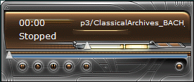
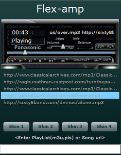
Presenting Winamp on Flex, this has been implemented completely in Flex.

The Application is skinnable using any winamp classic skin. Just put the skin in the assets folder (lowercase file names please).
It can read pls and m3u playlist. Currently supported controls are Rev, Fwd, Play, Pause, Stop, Volume.

Skins can be changed on the fly by just calling the setSkin function. I have not skinned the playlist because people would want to customize it.

Made this quite a while ago, but was not getting time to make it a bit robust.


Source

The SoundPlayer class posted in the source implements play, pause, stop and error / state management. There is no UI in this class. The UI is implemented by WinampClassicUI component.

Eject button does not do anything currently. Any custom code can be added to it.

If there are any bugs, please just post a note and I will post a fix.

Tuesday, June 13, 2006

Marquee

This component can be used to put a marquee in a Flex 2.0 App.
Hello World
Example:

<?xml version="1.0"?>
<mx:Application xmlns:mx="http://www.adobe.com/2006/mxml" xmlns="*">

<Marquee text="Hello World " width="200" />
<Marquee text="This is a test marquee to display the behavior"
direction="both" width="100" />

</mx:Application>

Component Code
Demo

Tuesday, May 30, 2006

Bitmap Skinned Buttons

I was trying to make a skinnable application which had multiple buttons, but I didnt want to put a separate bitmap for each state of each button. I had one bitmap containing all the states of all buttons, something like the following.


I have made a custom "SkinnedButton" class which lets me use such skins. I just need to give the coordinates of the UP, DOWN, OVER and DISABLED states and an Image.

The code that produces this looks like this.


<?xml version="1.0"?>
<mx:Application xmlns:mx="http://www.adobe.com/2006/mxml" xmlns="*" width="100%"
height="100%">

<mx:Canvas width="150" height="50" x="10" y="0">
<mx:Image id="bkground" source="@Embed('background.png')"/>
<mx:Image id="skin" source="@Embed('cbuttons.png')" includeInLayout="false" visible="false"/>

<SkinnedButton id="bprev" x="0" y="0"
upX="0" upY="0" downX="0" downY="18"
alpha="0" skin="{skin}" backgroundImage="{bkground}" width="23" height="18" cornerRadius="5" />

<SkinnedButton id="bplay" x="23" y="0"
upX="23" upY="0" downX="23" downY="18"
alpha="0" skin="{skin}" backgroundImage="{bkground}" width="23" height="18" cornerRadius="5" />

<SkinnedButton id="bpause" x="46" y="0"
upX="46" upY="0" downX="46" downY="18"
alpha="0" skin="{skin}" backgroundImage="{bkground}" width="23" height="18" cornerRadius="5" />

<SkinnedButton id="bstop" x="69" y="0"
upX="69" upY="0" downX="69" downY="18"
alpha="0" skin="{skin}" backgroundImage="{bkground}" width="23" height="18" cornerRadius="15" />

<SkinnedButton id="bnext" x="92" y="0"
upX="92" upY="0" downX="92" downY="18"
alpha="0" skin="{skin}" backgroundImage="{bkground}" width="23" height="18" cornerRadius="15" />
</mx:Canvas>

</mx:Application>


Code and Example

Friday, May 19, 2006

Docker

This is a component to make Dockable Menus and Toolbars, similar to Microsoft Products. It looks somewhat like this.


There are 3 ToolBars in this example. One containing a Menu docked to the top. One floating and one docked to the bottom.

The Basic organisation of a docker is like this:

<mx:Application>
<Docker width="100%" height="100%">
<DockableToolBar id="toolbar3" width="100%" minWidth="0">
<mx:MenuBar id="menubar" dataProvider="{myMenuBarData}" showRoot="false"/>
</DockableToolBar>

<DockableToolBar id="toolbar" width="100%" minWidth="0">
Toolbar Controls
Toolbar Controls
Toolbar Controls
</DockableToolBar>

Other Application Elements
</Docker>
</mx:Application>

Example and Source

You need Flex 2.0 Beta 3 to compile and run the source.

Thursday, May 18, 2006

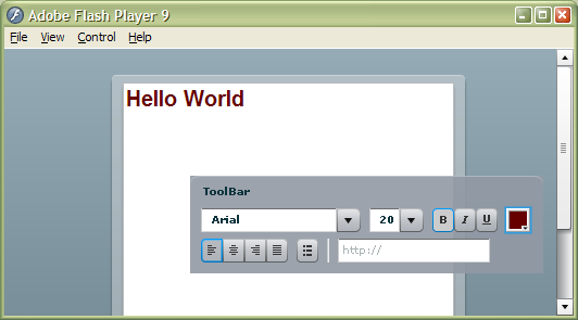
RichTextEditor with floating Toolbar

If you are wondering how to make the Toolbar of a RichTextEditor floating. Here's the code:


<?xml version="1.0" encoding="utf-8"?>
<mx:Application xmlns:mx="http://www.adobe.com/2006/mxml" xmlns="*" height="100%">
<mx:Style>
TitleWindow
{
backgroundAlpha: 0.9;
backgroundColor: #9199A4;
borderColor: #9199A4;
borderAlpha: 1.0;
borderStyle: "none";
borderThickness: 0;
paddingBottom: 0;
paddingLeft: 0;
paddingRight: 0;
paddingTop: 0;
}
</mx:Style>

<mx:Script>
<![CDATA[
import mx.managers.*;

private function floatControlBar() : void
{
rteControl.parent.removeChild(rteControl);
rteControl.addChild(DisplayObject(rte.toolbar));
rte.showControlBar=false;
mx.managers.PopUpManager.addPopUp(rteControl, rte, false);
}
]]>
</mx:Script>

<mx:RichTextEditor id="rte" htmlText="" headerHeight="5"
creationComplete="floatControlBar()"/>
<mx:TitleWindow id="rteControl" width="325" title="ToolBar"/>

</mx:Application>

Phew

Finally its done. Been procrastinating for a long time.

The intent of this blog is to post flex sample components, apps, demos here for public use.

Everything posted on this blog can be considered freeware for use by anyone. The code is available under MIT License .
Please do send me a note if you are using it on a publicly available web url (feels good to know that my work is being put to some use)

I would be posting a few samples shortly.